1. Problem
You want to customize the look and feel of a control
by setting various properties. Furthermore, you want to create an
artifact that can be used repeatedly to apply these property values to
multiple controls of the same type.
2. Solution
Create a style in XAML containing the necessary
property settings. Then, apply the style to all controls of that type to
get a consistent look and feel.
3. How It Works
A style is a collection of property value settings
targeted to a control of a specific type. Styles are typically defined
in XAML as a resource in a ResourceDictionary. The TargetType property for a style determines what control type the Style can be applied to. Once defined, the style can be accessed in XAML using the StaticResource markup extension.
Property settings in style definitions are defined using the <Setter> element, where Setter.Property is set to the name of the property on the target that you want the style to influence and Setter.Value contains the value that you want to apply. The following code shows a simple style definition for a Button, where the Foreground and the FontSize properties of the Button will be set to the values specified in the style definition:
<Style TargetType="Button"
       x:Key="STYLE_Button">
  <Setter Property="Foreground"
          Value="#FFE41414" />
  <Setter Property="FontSize"
          Value="18" />
</Style>
The FrameworkElement base class, and as such every control in the Silverlight Control Framework, exposes a Style
dependency property. This property can be set on any control on a page,
either in XAML or in the codebehind, to apply a style to that control.
The following code shows the application of a style to a Button control:
<Button Style="{StaticResource STYLE_Button}" />
Starting with Silverlight 3, styles also support
inheritance (i.e., you can define a new style based on an existing
style). In the new style definition, you can choose to redefine existing
property settings to new values, as well as add new property settings.
The BasedOn attribute on a style definition needs to be set to
the base style from which you are inheriting the current style. This
code shows an inherited style definition:
<Style TargetType="Button"
       x:Key="STYLE_InheritedButton"
       BasedOn="{StaticResource STYLE_Button}">
  <Setter Property="Width"
          Value="225" />
  <Setter Property="FontFamily"
          Value="Trebuchet" />
</Style>
3.1. Style Scoping
Also recall that styles are declared as resources.
Consequently, in XAML markup, styles are scoped by the resource
dictionary to which they belong. For example, a style defined in the Resources section of a page can be applied to any element in that page at any level of the hierarchy, whereas a style defined in the Resources section of a Grid can only be applied to elements within that Grid. To have a style be universally available to an application, you can define the style in the Application.Resources section in your App.xaml file. You can also use a MergedResourceDictionary to bring in styles defined in external resource dictionaries.
4. The Code
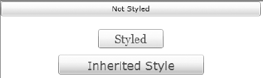
The code sample in Listing 1 demonstrates how to define styles and apply them to controls. The XAML page contains three instances each of a Button. Two of the Button instances have styles applied to them to illustrate the resulting changes in look and feel.
Listing 1. MainPage.xaml with a sample style targeting a button
<UserControl x:Class="Recipe5_1.MainPage"
             xmlns="http://schemas.microsoft.com/winfx/2006/xaml/presentation"
             xmlns:x="http://schemas.microsoft.com/winfx/2006/xaml"
             Width="400"
             Height="300">
  <UserControl.Resources>
    <Style TargetType="Button"
           x:Key="STYLE_Button">
      <Setter Property="Width"
              Value="100" />
      <Setter Property="Height"
              Value="30" />
      <Setter Property="Foreground"
              Value="#FFE41414" />
      <Setter Property="Background">
        <Setter.Value>
          <LinearGradientBrush EndPoint="0.5,1"
                               StartPoint="0.5,0">
            <GradientStop Color="#FFE26F56" />
            <GradientStop Color="#FFDA390B"
                          Offset="1" />
          </LinearGradientBrush>
        </Setter.Value>
      </Setter>
      <Setter Property="FontSize"
              Value="18" />
      <Setter Property="FontFamily"
              Value="Georgia" />
    </Style>

    <Style TargetType="Button"
           x:Key="STYLE_InheritedButton" BasedOn="{StaticResource STYLE_Button}">
      <Setter Property="Width"
              Value="225" />
      <Setter Property="FontFamily"
              Value="Trebuchet" />
      <Setter Property="Cursor"
              Value="Hand" />
<Setter Property="Margin"
              Value="0,10,0,10" />
    </Style>

  </UserControl.Resources>

  <StackPanel x:Name="LayoutRoot"
              Background="White">
    <Button Content="Not Styled"
            Margin="0,0,0,20" />

    <Button Content="Styled" x:Name="Styled"
            Style="{StaticResource STYLE_Button}" />
    <Button Content="Inherited Style" x:Name="Inherited"
            Style="{StaticResource STYLE_InheritedButton}" />
  </StackPanel>

</UserControl>
|
The style named STYLE_Button is being applied to the Button named Styled, setting several properties including its Height, Width, Foreground, and Background brushes, as well as some of the fontrelated properties.
The style named STYLE_InheritedButton inherits from STYLE_Button. You override the Width property to change its value to 225 from the original 100, and you override the FontFamily property to change it to the Trebuchet font. You also add two new property settings in the inherited style: a Margin property value setting and a Cursor property value setting. STYLE_InheritedButton is then applied to the Button named Inherited.
NOTE
Note the property element syntax for defining the
Background property. The property element syntax allows setting the
property value as a child element to the <Setter>
element, instead of the inline string literal using the Value attribute.
This can be used when the values being set are complex enough that they
cannot be represented as a simple string literal.
Figure 1 shows the result of applying the style.
Also note the Content property setting of the Button in Listing 1. 