Alrighty, let’s take a moment and assess where we’re up to. We have a structure for our
pages and a flow for our application; we have a theme we want to go with, and we’ve looked
at some techniques we can use to give our design some flair. Let’s roll out the design to
the screens we’ve created.Most of the pages use the techniques and structures we’ve outlined already, but lets
break down a couple of these designs and look at them in further detail. First up is the Spots index, shown in Figure 1.
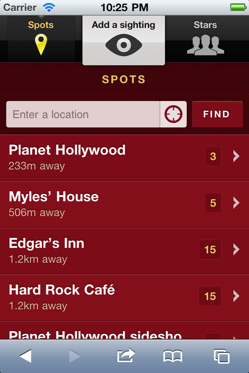
Here’s a quick review of the elements contained in this page:
actionable list items have an arrow that suggests more content
actionable list items have neutral text color, with the yellow reserved for
hyperlinks
a dark background with a lighter foreground
a “find” button with the same highlights we’re using for list rows
a button for geolocation tied into the text field (this suggests those functions are
linked—which they are—and reduces the number of separate elements in the form)
Figure 2 shows what the Spots listing will look like when
scrolled down to the bottom.
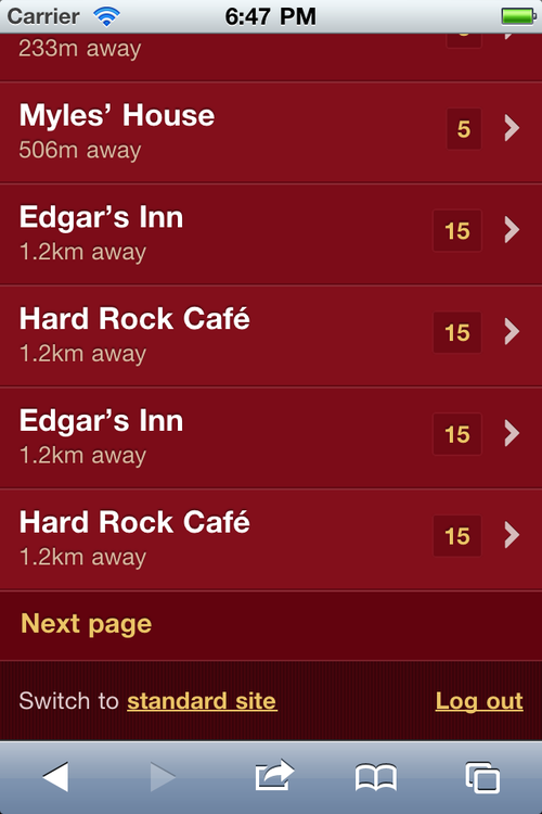
Some points to note here are:
The footer at the bottom includes links to the full (non-mobile) site, and the
ability to log out.
The “Next page” link (because we don’t want to load endless amounts of data over the
mobile network, especially when those results might be irrelevant for our users, as the
information is potentially old and out of date).
Next up is the detail view of a Spot, shown in Figure 3.
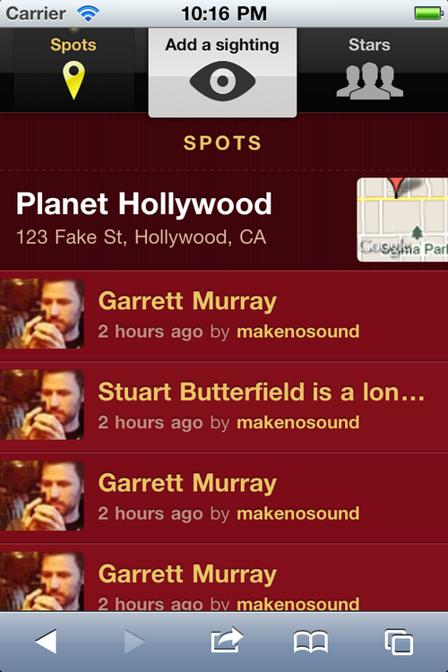
In this design, notice:
the main details are over the background, enabling the main content to sit in the
foreground area
that rows don’t have to be limited to a single action (we’re using a contrasting
yellow for standard hyperlinks)
a small thumbnail of a map (while practically useless at this size, a map is still
instantly recognizable, so we can use it as an icon linking to a real map)
The final design to review is the full-screen or standalone mode. Let’s look at
our Spots index in standalone, as shown in Figure 4.
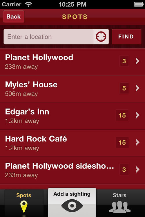
All the changes we made in the wireframing stage are reflected here, notably
that:
our navigation is at the bottom
we’re bringing in a header element, which establishes the context and gives us room
for more controls (such as our back button)