Finding a theme to riff on can give us a clarity of vision about the look of our app. In
the case of StarTrackr, we can start by thinking about the sort of imagery we associate with
celebrity. Here are a few ideas: money, the red carpet, sunglasses, flash photography, film,
movies, music, awards shows, the Oscars, stars, gold, diamonds, paparazzi, glamor.Which items on that list stand out as the strongest images? The colors. The red
carpet is synonymous with celebrity, while the color gold brings to mind wealth and glamor.
Luckily for us, those colors should work well together, so we can create a palette with
which to build our design. What we’ve come up with is shown in Figure 1.
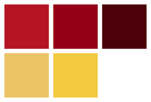
Of those colors the reds are much richer, so they’re a more appropriate base for our
application. A nice way of testing out multiple color choices is by putting together a basic
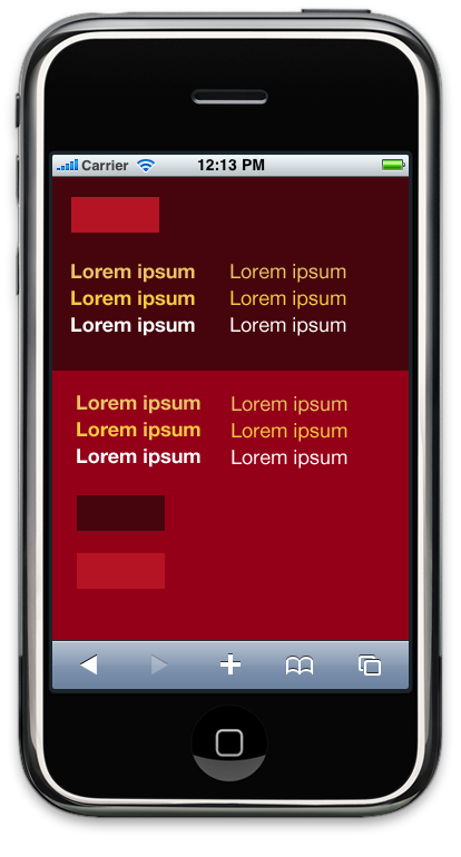
in situ comparison. Let’s look at one example, in Figure 2.
It gives us a sense of which colors work best together, and which ones clash. With the
colors we’ve chosen, notice that even though they’re completely flat, the darker red gives
the impression of sitting behind the bright red. We can use this
natural depth to our advantage, giving an implied structure to our interface without
resorting to over-the-top effects.
1. Touchable Interfaces
Touchscreen devices let users interact directly and physically with an
interface, so we want to build a design that feels touchable. One of
the secrets to creating beautiful interfaces is to steal some tricks from the real world.
Real objects have presence and volume, and their surfaces have variations in light and
texture.
They also have a consistent light source. Nothing stands out more in a
carefully crafted interface than a shine or shadow that’s coming from the wrong direction.
Always keep in mind where the light is coming from. We have some leeway—the angle of light
doesn’t need to be identical for all elements, and in some cases you’ll need to change the
direction subtly—but in general, we’ll try to make sure our light source appears to be
coming from above our interface elements. That means shine on the top, shadows on the
bottom.
It’s useful to imagine the objects in our interface sitting in the
same room; that way we can understand how the light might affect them based on where
they’re located. We’re going to follow convention a little here and build up an iOS-like tab
bar, so let’s have a look at the finished product and the various lighting effects used to
build it up in Figure 3.
Here are the key features of our design:
light source from above
gradient overlay to give the bar a round, physical presence
highlight from above
disappearing into shadow at the bottom
hard line in the middle indicating the apex of the curve (when compared to the
light)
simple icons
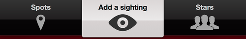
That’s our tab bar in its default state—but in fact it’ll never look
like that in use. Our users will always be somewhere in our application, which means that
one of the items will always be selected. How might that look? Figure 4 gives an idea.
Here’s a breakdown of the key features of the selected
state:
dark overlay to increase contrast on the selected button
use of a contrasting color, in this case the gold color from our palette
a subtle spot to draw attention
added depth—highlights and shadow—to our interface icon
The task of styling the tab bar requires a delicate balance. We want to
separate it from our content without having it disappear into the background completely.
By using muted colours—or rather a lack of color—we’re making the distinction between menu
and content clear.
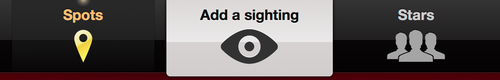
We’re also doing something a little out of the ordinary
with our tab bar. Usually, each item in the bar has the same style and weighting. This
assumes that each of those items is conceptually similar, but in our case one of them
isn’t. “Spots” and “Stars” let our users view content, while the “Add a sighting” item
lets them add content. We’ve played on that distinction and given the
“Add a sighting” button a contrasting style in an attempt to encourage our users to
contribute. There are a number of examples of native applications that use this pattern to
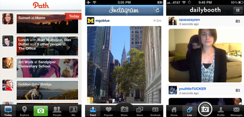
draw attention to the function items in their tab bar, as shown in Figure 5.
2. Interface Icons
In our tab bar, we’re using icons alongside text to reinforce the function behind each
menu item, as well as adding graphical flair to the design. Both Android and iOS have
similar design philosophies for their interface icons—namely that they’re simple
monochrome icons. This makes it easier to create a consistent iconography, and lets us use
color in the icons to indicate selected (and other) states for each tab.
It’s most important to find icons with the right metaphor to represent your content.
As one of the tab bar items in our app is “Stars,” using an actual star as that tab’s icon
would at first seem to make perfect sense. Yet, when you ponder over it more, problems
begin to surface. The star has traditionally had a specific use in many applications:
favorites (or “starred” items). If we used a star here, we’d essentially be asking our
users to ignore their previous expectations. It makes more sense to use a closer
representation of the actual content. In the case of “Stars,” that content is a list of
celebrities, so using human silhouettes is a better fit.
The other icons for our tab bar are a little easier to decide on. Spots are locations,
so some sort of map-related symbol makes sense. We’re going to use a Google Maps-style
marker, as it’s simple and recognizable. For sightings, we’re trying to suggest the act of
seeing a celebrity. We could use cameras, glasses, binoculars, or autographs—but they’re
all either hard to make out in the form of a tiny icon, or, as with stars, have
associations with other common functions. An eye icon is the simplest and easiest to
understand for that function, so that’s what we’ll use.
“But,” you protest, “I’m terrible at drawing—my magnifying glasses always end up
looking like spoons! Is there somewhere I can access icons?” Yes, there is! Recently,
there’s been a proliferation of great royalty-free interface icon sets released, making it
incredible easy to find a consistent iconography for an application. Some of the most
useful are:
Glyphish, http://glyphish.com/
A set of 200 or so icons that are available as a free set with attribution
requirements, or US$25 for the Pro version.
Helveticons, http://helveticons.ch/
A lovely set of up to 477 icons based on the letterforms of the typeface
Helvetica Bold. Costs are between US$279 and US$439, depending on the set.
Pictos, http://pictos.drewwilson.com/
Pictos is actually three separate sets consisting of 648 icons! The vector packs
for each set are between US$19 and US$29, and are an absolute steal at that
price.
Tip:
A Pixel is no Longer a Pixel
We can no longer assume that we’re designing for a single
resolution. The iPhone 3GS is 163ppi (pixels per inch), while the iPhone 4 is double
that at 326ppi; the iPad is lower at 132ppi, and the Palm Pre sits around the middle at
186ppi. Android’s developer guidelines split its devices into three categories: low
density, medium density, and high density screens.
What that means for us is
that we need to design in high resolution. More and more you’ll have to create
resolution-independent interfaces, so you can save yourself an enormous amount of time
by building designs that way from the start. This doesn’t necessarily require you to
throw out your favorite bitmap tools and start jumping into a vector world, but it does
mean thinking about the end product throughout the design process. For example, instead
of creating gradients in Photoshop using, say, bitmaps layered on top of each other,
you’re better off making those effects using layer styles. That way you can resize those
elements without losing definition.
3. Typography
Typography is central to good web design, yet it’s a skill
that’s often glossed over in favor of shinier features. We’re trying to communicate with
people, and most of the time that means presenting information or options for them to read
and then act upon. Text is user interface. Not only that, but a judicious choice and use
of type can give your application meaning.
Unfortunately, the typographic
landscape in the mobile space leaves much to be desired. For us web designers, this is
nothing new: we’re used to finding creative ways to work the limited palette of web-safe
fonts. That palette is unfortunately significantly smaller in the world of mobile devices,
but it’s no excuse to eschew typographic discipline. There are exceptions to this rule,
but many mobile devices will have an extremely limited choice of fonts, perhaps only one
or two—and those fonts are often not the same from one platform to the next.
Note:
Or rather, it’s not. The world of web typography is an exciting place at the moment,
mostly due to support for embedding additional fonts via the @font-face CSS rule. Whilst we’ll avoid going into the specifics of
@font-face here, we’d be remiss if we failed to mention the support
for it in the mobile space. @font-face embedding is possible in most
WebKit-based mobile browsers, and Opera mobile—though older versions of iOS require SVG
fonts in order to work.
The biggest downside to using @font-face in a mobile application
is performance. Font files are frequently very large; even using a subset of a single
weight of a typeface can add an overhead of 100KB of data. For a project that’s
targeting mobile users, that’s often too much to ask. Speed is a feature, so creating a
bottleneck in the pursuit of a little extra flair often makes little sense.
4. Performance Considerations
It’s easy to get carried away when designing a mobile app. There are so many examples
of stunning interface design on all the native platforms, that it’s hard to not want to
compete. Alas, we need to be careful about how we use effects in our design. If we create
an interface that requires lots of images to implement in HTML and CSS, we may run into
performance problems, particularly in scroll-heavy applications. This is one of the
unfortunate trade-offs between a native application and a web app. In a native
application, we can create beautiful hardware-optimized and accelerated graphical effects
using the drawing APIs available in the various native SDKs. The drawing tools available
to web apps are a bit more limited. As much as possible, we should be thinking about
designing interface elements that we can implement using mostly CSS.
“But we just made a beautiful tab bar! Do we have to throw that all away?” Well, no.
Having some heavier graphical effects for the tab bar is no big deal. It will either
remain on-screen in a static position all the time, or drop off the page promptly once a
user scrolls down. The rows of our main lists, on the other hand, are elements that we
should try to keep simple. We can still make them look beautiful, we just have to be a
little more inventive. For our list rows, we’re going to start with a solid color for each
row, but using a slightly different shade for alternating odd and even rows, as Figure 6 shows.
Looks a bit flat, right? Let’s give those rows a little “pop” with some
lighting effects. The easiest way with an interface element like this—a multi-item list
with content that could potentially vary in size—is to add a highlight to the top edge and
an inset shadow to the bottom edge, as in Figure 7
That’s much better! It’s a subtle effect, but it really helps lift the interface and
lets our users focus on the content. Plus, it can be implemented using only CSS border
properties, so it passes our performance requirements. The problem now is that our text
feels a little flat—because it appears to be unaffected by the same light that’s adding
the highlights and shadows to the rows of our list. Thankfully, we can use the same visual
trick to give the text a little more physicality, as Figure 8 demonstrates.

Here we’re just adding a one-pixel black shadow to the top edge of our letterforms.
This gives the impression that the type has been physically stamped into the interface,
the way a letterpress imprints onto paper. It’s a simple effect, but it needs to be used
carefully: if the text to which we’re adding a shadow is too small, it can lose
readability.
Truer words were never spoken. A subtle interface lets the content of our application
speak for itself. Using cheap and over-the-top effects will only distract our users from
what we’re trying to tell them. Our interface should define a structure for our content
and help our users understand the function of our application. Great design is functional,
not flashy.