Formatting consists of several related
tasks. First, you want to ensure that dates, currencies, and other
number values are presented in the appropriate way. You handle this job
with the DataFormatString property. Next, you'll want to apply the
perfect mix of colors, fonts, borders, and alignment options to each
aspect of the grid, from headers to data items. The GridView supports
these features through styles. Finally, you can intercept events,
examine row data, and apply formatting to specific values
programmatically. In the following sections, you'll consider each of
these techniques.
The GridView also exposes several self-explanatory
formatting properties that aren't covered here. These include GridLines
(for adding or hiding table borders), CellPadding and CellSpacing (for
controlling the overall spacing between cells), and Caption and
CaptionAlign (for adding a title to the top of the grid).
|
Want to create a GridView that
scrolls—inside a web page? It's easy. Just place the GridView inside a
Panel control, set the appropriate size for the panel, and set the
Panel.Scrollbars property to Auto, Vertical, or Both.
|
|
1. Formatting Fields
Each BoundField column provides a DataFormatString
property you can use to configure the appearance of numbers and dates
using a format string.
Format strings generally consist of a placeholder and
a format indicator, which are wrapped inside curly brackets. A typical
format string looks something like this:
{0:C}
In this case, the 0 represents the value that will be
formatted, and the letter indicates a predetermined format style. Here,
C means currency format, which formats a number as an amount of money
(so 3400.34 becomes $3,400.34, assuming the web server is set to use
U.S. regional settings). Here's a column that uses this format string:
<asp:BoundField DataField="UnitPrice" HeaderText="Price"
  DataFormatString="{0:C}" />
Table 1 shows some of the other formatting options for numeric values.
Table 1. Numeric Format Strings
| Type | Format String | Example |
|---|
| Currency | {0:C} | $1,234.50. Brackets indicate negative values: ($1,234.50). The currency sign is locale-specific. |
| Scientific (Exponential) | {0:E} | 1.234500E+003 |
| Percentage | {0:P} | 45.6% |
| Fixed Decimal | {0:F?} | Depends on the number of decimal places you set. {0:F3} would be 123.400. {0:F0} would be 123. |
You can find other examples in the MSDN Help. For
date or time values, you'll find an extensive list. For example, if you
want to write the BirthDate value in the format month/day/year (as in
12/30/08), you use the following column:
<asp:BoundField DataField="BirthDate" HeaderText="Birth Date"
 DataFormatString="{0:MM/dd/yy}" />
Table 2 shows some more examples.
Table 2. Time and Date Format Strings
| Type | Format String | Syntax | Example |
|---|
| Short Date | {0:d} | M/d/yyyy | 10/30/2010 |
| Long Date | {0:D} | dddd, MMMM dd, yyyy | Monday, January 30, 2010 |
| Long Date and Short Time | {0:f} | dddd, MMMM dd, yyyy HH:mm aa | Monday, January 30, 2010 10:00 AM |
| Long Date and Long Time | {0:F} | dddd, MMMM dd, yyyy HH:mm:ss aa | Monday, January 30 2010 10:00:23 AM |
| ISO Sortable Standard | {0:s} | yyyy-MM-ddTHH:mm:ss | 2010-01-30T10:00:23 |
| Month and Day | {0:M} | MMMM dd | January 30 |
| General | {0:G} | M/d/yyyy HH:mm:ss aa (depends on locale-specific settings) | 10/30/2010 10:00:23 AM |
The format characters are not specific to the
GridView. You can use them with other controls, with data-bound
expressions in templates, and as parameters for many methods. For example, the Decimal
and DateTime types expose their own ToString() methods that accept a
format string, allowing you to format values manually.
16.2.2. Using Styles
The GridView exposes a rich formatting model that's based on styles. Altogether, you can set eight GridView styles, as described in Table 3.
Table 3. GridView Styles
| Style | Description |
|---|
| HeaderStyle | Configures the appearance of the header row that contains column titles, if you've chosen to show it (if ShowHeader is True). |
| RowStyle | Configures the appearance of every data row. |
| AlternatingRowStyle | If
set, applies additional formatting to every other row. This formatting
acts in addition to the RowStyle formatting. For example, if you set a
font using RowStyle, it is also applied to alternating rows, unless you
explicitly set a different font through AlternatingRowStyle. |
| SelectedRowStyle | Configures the appearance of the row that's currently selected. This formatting acts in addition to the RowStyle formatting. |
| EditRowStyle | Configures the appearance of the row that's in edit mode. This formatting acts in addition to the RowStyle formatting. |
| EmptyDataRowStyle | Configures the style that's used for the single empty row in the special case where the bound data object contains no rows. |
| FooterStyle | Configures the appearance of the footer row at the bottom of the GridView, if you've chosen to show it (if ShowFooter is True). |
| PagerStyle | Configures the appearance of the row with the page links, if you've enabled paging (set AllowPaging to True). |
Styles are not simple single-value properties.
Instead, each style exposes a Style object that includes properties for
choosing colors (ForeColor and BackColor), adding borders (BorderColor,
BorderStyle, and BorderWidth), sizing the row (Height and Width),
aligning the row (HorizontalAlign and VerticalAlign), and configuring
the appearance of text (Font and Wrap). These style properties allow you
to refine almost every aspect of an item's appearance.
Here's an example that changes the style of rows and headers in a GridView:
<asp:GridView ID="GridView1" runat="server" DataSourceID="sourceProducts"
  AutoGenerateColumns="False">
    <RowStyle BackColor="#E7E7FF" ForeColor="#4A3C8C" />
    <HeaderStyle BackColor="#4A3C8C" Font-Bold="True" ForeColor="#F7F7F7" />
    <Columns>
      <asp:BoundField DataField="ProductID" HeaderText="ID" />
      <asp:BoundField DataField="ProductName" HeaderText="Product Name" />
      <asp:BoundField DataField="UnitPrice" HeaderText="Price" />
    </Columns>
</asp:GridView>
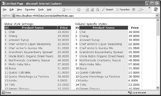
In this example, every column is affected by the
formatting changes. However, you can also define column-specific styles.
To create a column-specific style, you simply need to rearrange the
control tag so that the formatting tag becomes a nested tag inside the appropriate column tag. Here's an example that formats just the ProductName column:
<asp:GridView ID="GridView2" runat="server" DataSourceID="sourceProducts"
  AutoGenerateColumns="False" >
    <Columns>
      <asp:BoundField DataField="ProductID" HeaderText="ID" />
      <asp:BoundField DataField="ProductName" HeaderText="Product Name">
        <ItemStyle BackColor="#E7E7FF" ForeColor="#4A3C8C" />
        <HeaderStyle BackColor="#4A3C8C" Font-Bold="True" ForeColor="#F7F7F7" />
      </asp:BoundField>
      <asp:BoundField DataField="UnitPrice" HeaderText="Price" />
    </Columns>
</asp:GridView>
Figure 1
compares these two examples. You can use a combination of ordinary
style settings and column-specific style settings (which override
ordinary style settings if they conflict).
One reason you might use column-specific formatting
is to define specific column widths. If you don't define a specific
column width, ASP.NET makes each column just wide enough to fit the data
it contains (or, if wrapping is enabled, to fit the text without
splitting a word over a line break). If values range in size, the width
is determined by the largest value or the width of the column header,
whichever is larger. However, if the grid is wide enough, you might want
to expand a column so it doesn't appear to be crowded against the
adjacent columns. In this case, you need to explicitly define a larger
width.
2.1. Configuring Styles with Visual Studio
There's no reason to code style properties by hand in
the GridView control tag, because the GridView provides rich
design-time support. To set style properties, you can use the Properties
window to modify the style properties. For example, to configure the
font of the header, expand the HeaderStyle property to show the nested
Font property, and set that. The only limitation of this approach is
that it doesn't allow you to set the style for individual columns—if you
need that trick, you must first call up the Fields dialog box by editing the Columns property. Then, select the appropriate column, and set the style properties accordingly.
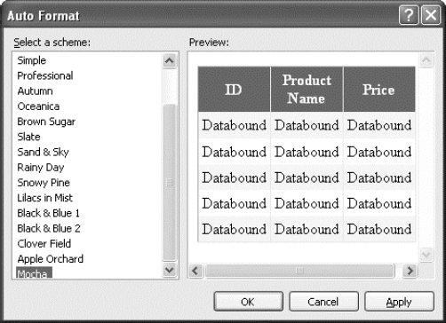
You can even set a combination of styles using a preset theme by clicking the Auto Format link in the GridView smart tag. Figure 2
shows the Auto Format dialog box with some of the preset styles you can
choose. Select Remove Formatting to clear all the style settings.
Once you've chosen and inserted the styles into your
GridView tag, and you can tweak them by hand or by using the Properties
window.
3. Formatting-Specific Values
The formatting you've learned so far isn't that
fine-grained. At its most specific, this formatting applies to a single
column of values. But what if you want to change the formatting for a
specific row or even just a single cell?
The solution is to react to the GridView.RowDataBound
event. This event is raised for each row, just after it's filled with
data. At this point, you can access the current row as a GridViewRow
object. The GridViewRow.DataItem property provides the data object for
the given row, and the GridViewRow.Cells collection allows you to
retrieve the row content. You can use the GridViewRow to change colors
and alignment, add or remove child controls, and so on.
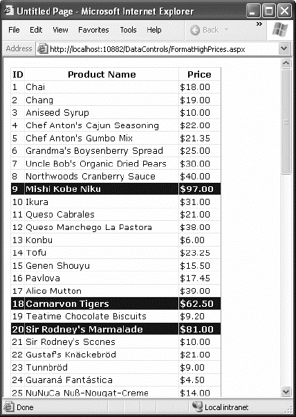
The following example handles the RowDataBound event
and changes the background color to highlight high prices (those more
expensive than $50):
Protected Sub GridView1_RowDataBound(ByVal sender As Object, _
  ByVal e As System.Web.UI.WebControls.GridViewRowEventArgs) _
  Handles GridView1.RowDataBound

    If e.Row.RowType = DataControlRowType.DataRow Then
        ' Get the price for this row.
        Dim price As Decimal
        price = CType(DataBinder.Eval(e.Row.DataItem, "UnitPrice"), Decimal)

        If price > 50 Then
            e.Row.BackColor = System.Drawing.Color.Maroon
            e.Row.ForeColor = System.Drawing.Color.White
            e.Row.Font.Bold = True
        End If
    End If
End Sub
First, the code checks whether the item being created
is a row or an alternate row. If neither, it means the item is another
interface element, such as the pager, footer, or header, and the
procedure does nothing. If the item is the right type, the code extracts
the UnitPrice field from the data-bound item.
To get a value from the bound data object (provided
through the GridViewRowEventArgs.Row.DataItem property), you need to
cast the data object to the correct type. The trick is that the type
depends on the way you're performing your data binding. In this example,
you're binding to the SqlDataSource in DataSet mode, which means each
data item will be a DataRowView object. (If you were to bind in
DataReader mode, a DbDataRecord represents each item instead.) To avoid
coding these details, which can make it more difficult to change your
data access code, you can rely on the DataBinder.Eval() helper method,
which understands all these types of data objects. That's the technique
used in this example.
Figure 3 shows the resulting page.