1. Problem
You want to display a portion of the UI in a pop-up in response to an input event such as a mouse click.
2. Solution
Use the Popup element to contain and display the necessary UI.
3. How It Works
Pop-ups are frequently used
in UI design to display on-the-fly information in response to input
events. Typical examples include cascading menus, context menus, the
drop-down portion of a combo box, and tooltips. Silverlight includes a
type named Popup in the System.Windows.Controls.Primitives namespace. The Popup type is used by several other controls in the framework, such as the DatePicker, the ToolTip, and the DataGrid. You can use it in your own code as well.
3.1. Creating and Initializing the Pop-up
The Popup type is not a control—it derives directly from the FrameworkElement
type. It is meant to be a container for a tree of elements and,
therefore, has no visual representation of its own. While you can
include a Popup in XAML, because of positioning requirements, it is much more common to create an instance of the Popup in code and set its Child property to the root of the element tree representing the content you want to display inside the Popup. This code shows setting a ListBox as the Popup.Child:
Popup popupProducts = new Popup();
ListBox popupContent = new ListBox();
popupProducts.Child = popupContent;
Once you have prepared the Popup, you can toggle the Popup.IsOpen property to show or hide it.
3.2. Positioning the Pop-up
In most cases, you want to display the Popup
at a dynamically determined position on the page, relative to
coordinates of an input event, such as a mouse click, or to that of some
other element on the form. This explains why a Popup is
typically not included by a designer in the XAML for the page but rather
created in code—it does not make sense to subject it to the constraints
of the layout system and determine its position up front unless you are
using absolute positioning and a container like the Canvas.
To assist in the process of determining its position, the Popup type exposes two properties of type double: VerticalOffset and HorizontalOffset. These properties define offsets from the top and left corners, respectively, of the root element of the Page and are both set to zero by default, causing the Popup to display at the top-left corner of the Page root. To determine the appropriate page-based offsets for a Popup
relative to some other element on the page, you need to perform some
coordinate transforms. To understand this problem a little better, take a
look at Figure 1.
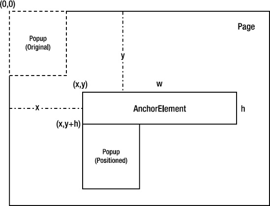
When you initially create a Popup instance, it is located at the top-left corner of the Page at coordinates (0,0) which is shown by the dotted outline of the Popup in Figure 1.
Let's assume you need to align the Popup to the bottom-left corner of an element in the Page named AnchorElement, which has Width set to w and Height set to h; its top-left coordinates are (x,y) relative to the Page, as shown in Figure 5-17. If you defined the Popup's desired coordinates with respect to the AnchorElement's coordinate space alone, they would be (0,h).
However, since you are going to position the Popup within the Page, you need to translate (0,h) in AnchorElement's coordinate space (the source coordinate space) to a suitable set of coordinates in the Page's
coordinate space (the target coordinate space). Those would be (x,y +
h) for it to be positioned at the desired spot, which means that the Popup needs to be offset by x horizontally and by y + h vertically from its original position of (0,0) within the Page to reach its new position.
The following code shows how to achieve this:
GeneralTransform coordTnsfrm = this.TransformToVisual(AnchorElement);
Point pt = coordTnsfrm.Transform(new Point(0.0, AnchorElement.ActualHeight));
popupProducts.HorizontalOffset = pt.X;
popupProducts.VerticalOffset = pt.Y;
Here you invoke TransformToVisual() on an UIElement that owns the target coordinate space and pass in another UIElement whose coordinate space acts as the source. The GeneralTransform that is returned from the call to TransformToVisual() can then be used to transform a Point defined in the source space to one in the target space.
You also transform a Point in AnchorElement's coordinate space with X set to 0 and Y set to the height of AnchorElement (i.e., the bottom-left corner of AnchorElement) to the appropriate equivalent in the Page's coordinate space. You then use the X,Y values of the resulting Point to set the HorizontalOffset and the VerticalOffset values on the Popup to position it as you intended on the page.
3.3. Creating Pop-up Content
In initializing a Popup in code with content—that is, setting its Child
property—you should avoid creating and initializing the entire content
in code, especially if the content represents a fairly complex UI. You
almost always want to take advantage of tools like Expression Blend to
do that.
In the following code sample, you simply need a single ListBox to be the only child of the Popup.
Therefore, you are not burdened with creating an overly complex UI in
code. However, if you are ever faced with this challenge elsewhere and
want to avoid the need to code an UI tree, you can use the ContentControl and data templates shown here:
Popup popupProducts = new Popup();
ContentControl popupContent = new ContentControl();
popupContent.ContentTemplate = this.Resources["dtPopupData"] as DataTemplate;
popupProducts.Child = popupContent;
popupContent.DataContext = ProdList;
Set the ContentTemplate of the ContentControl to a data template resource, initialize Popup.Child with the ContentControl, and then bind the ContentControl to appropriate data. This gives you the opportunity to host a fairly complex UI in a Popup
but design it as a data template using a tool like Expression Blend,
thus expressing it as XAML and keeping your code free of significant
element creation and initialization logic.
4. The Code
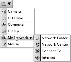
The code sample for this recipe uses the Popup type to build a cascading menu that looks similar to the ones in Visual Studio.
Figure 2
shows the resulting menu's look and feel. Keep in mind that this sample
does not aim to illustrate a full-scale menu framework but rather just a
usage pattern for the Popup type. However, if you ever do build a menu system using Silverlight, you will probably use the Popup type, and the code in this sample will come in handy.
Listing 1 shows the MenuItemData class used to hold the data for a single menu item.
Listing 1. Data type for a single menu item
using System.Collections.Generic;
using System.Windows;
using System.Windows.Media.Imaging;

namespace Recipe5_4
{
  //data for a single menu item
  public class MenuItemData
  {
    //image URI string used to load the image
    internal string ImageUri
    {
      set
      {
        MenuItemImage = new BitmapImage();
        MenuItemImage.SetSource(this.GetType().Assembly.
          GetManifestResourceStream(this.GetType().Namespace + "." + value));
      }
    }
    //menu item image
    public BitmapImage MenuItemImage { get; set; }
    //menu item caption
    public string MenuItemCaption { get; set; }
    //children items for submenus
    public List<MenuItemData> Children { get; set; }
    //parent menu item
    public MenuItemData Parent { get; set; }
    //toggle submenu arrow visibility based on presence of children items
    public Visibility SubMenuArrow
    {
get
      {
        return (Children == null
          || Children.Count == 0 ?
          Visibility.Collapsed : Visibility.Visible);
      }
    }
  }
}
|
The ImageUri property setter is used to load an image bitmap that can be accessed through the MenuItemImage property.A submenu is defined by having entries in the Children collection. For an item in a submenu, the parent MenuItemData instance is contained in the Parent property. The SubMenuArrow
property will be bound appropriately in XAML to control the visibility
of the right arrow mark that indicates the presence of a submenu.
Listing 2 shows the codebehind for the page.
Listing 2. Codebehind for the MainPage used to display the pop-up menu
using System.Collections.Generic;
using System.Windows;
using System.Windows.Controls;
using System.Windows.Controls.Primitives;
using System.Windows.Input;
using System.Windows.Media;

namespace Recipe5_4
{
  public partial class MainPage : UserControl
  {
    //data for the top level menu
    internal List<MenuItemData> TopMenuData = null;
    //popups for the topmenu and the submenu
    Popup TopMenu, SubMenu;
    //Listboxes for the menu content
    ListBox lbxTopMenu, lbxSubMenu;

    public MainPage()
    {
      InitializeComponent();
      //initialize the menu data
      TopMenuData = new List<MenuItemData>
      {
        new MenuItemData{MenuItemCaption="Camera", ImageUri="Camera.png"},
        new MenuItemData{MenuItemCaption="CD Drive",ImageUri="CD_Drive.png"},
new MenuItemData{MenuItemCaption="Computer",ImageUri="Computer.png"},
        new MenuItemData{MenuItemCaption="Dialup",ImageUri="Dialup.png"},
        new MenuItemData{MenuItemCaption="My Network",ImageUri="mynet.png"},
        new MenuItemData{MenuItemCaption="Mouse",ImageUri="Mouse.png"}
      };

      TopMenuData[4].Children = new List<MenuItemData>
        {
            new MenuItemData{MenuItemCaption="Network Folder",
              ImageUri="Network_Folder.png",Parent = TopMenuData[4]},
            new MenuItemData{MenuItemCaption="Network Center",
              ImageUri="Network_Center.png",Parent = TopMenuData[4]},
            new MenuItemData{MenuItemCaption="Connect To",
              ImageUri="Network_ConnectTo.png",Parent = TopMenuData[4]},
            new MenuItemData{MenuItemCaption="Internet",
              ImageUri="Network_Internet.png",Parent = TopMenuData[4]}
            };

      //create and initialize the top menu popup
      TopMenu = new Popup();
      lbxTopMenu = new ListBox();
      //set the listbox style to apply the menu look templating
      lbxTopMenu.Style = this.Resources["styleMenu"] as Style;
      //bind the topmenu data
      lbxTopMenu.ItemsSource = TopMenuData;
      TopMenu.Child = lbxTopMenu;

      //create and initialize the submenu
      SubMenu = new Popup();
      lbxSubMenu = new ListBox();
      lbxSubMenu.MouseLeave += new MouseEventHandler(lbxSubMenu_MouseLeave);
      lbxSubMenu.Style = this.Resources["styleMenu"] as Style;
      SubMenu.Child = lbxSubMenu;
    }

    //set the top menu position
    private void SetTopMenuPosition(Popup Target,
      FrameworkElement CoordSpaceSource)
    {
      //get the transform to use
      GeneralTransform transform = this.TransformToVisual(CoordSpaceSource);
      //transform the left-bottom corner
      Point pt = transform.Transform(new Point(0.0,
        CoordSpaceSource.ActualHeight));
      //set offsets accordingly
Target.HorizontalOffset = pt.X;
      Target.VerticalOffset = pt.Y;
    }
    //set the submenu position
    private void SetSubMenuPosition(Popup Target,
      FrameworkElement CoordSpaceSource, int ItemIndex,
      FrameworkElement ParentMenuItem)
    {

      //get the transform to use
      GeneralTransform transform = this.TransformToVisual(CoordSpaceSource);
      //transform the right-top corner
      Point pt = transform.Transform(
        new Point(ParentMenuItem.ActualWidth,
          CoordSpaceSource.ActualHeight +
          (ParentMenuItem.ActualHeight * ItemIndex)));
      //set offsets accordingly
      Target.HorizontalOffset = pt.X;
      Target.VerticalOffset = pt.Y;
    }

    private void btnDropDown_Click(object sender, RoutedEventArgs e)
    {
      //position the top menu
      SetTopMenuPosition(TopMenu, LayoutRoot);
      //show or hide
      TopMenu.IsOpen = !TopMenu.IsOpen;
    }

    private void LbxItemRoot_MouseEnter(object sender, MouseEventArgs e)
    {
      //get the listboxitem for the selected top menu item
      ListBoxItem lbxItem = (sender as Grid).Parent as ListBoxItem;
      //get the bound MenuItemData
      MenuItemData midTop = (sender as Grid).DataContext as MenuItemData;
      //do we have children and are we on the top menu?
      if (midTop.Parent == null &&
        (midTop.Children == null || midTop.Children.Count == 0))
      {
        //do not show the submenu
        SubMenu.IsOpen = false;
      }
      else if (midTop.Children != null && midTop.Children.Count > 0)
      {
        //yes - position sub menu
        SetSubMenuPosition(SubMenu, LayoutRoot, TopMenuData.IndexOf(midTop),
(sender as Grid));
        //bind to children MenuItemData collection
        lbxSubMenu.ItemsSource = midTop.Children;
        //show  submenu
        SubMenu.IsOpen = true;
      }

    }
    //leaving submenu - close it
    void lbxSubMenu_MouseLeave(object sender, MouseEventArgs e)
    {
      SubMenu.IsOpen = false;
    }
  }
}
|
In the constructor, you populate the data structures needed to create and initialize two Popups: TopMenu for the top-level menu, and SubMenu for a cascading submenu. ListBoxes lbxTopMenu and lbxSubMenu are used to provide the content inside the Popups, with a style named styleMenu customizing them to look like a menu. The data for the menus is stored as MenuItemData instances in the TopMenuData collection, with the Children property of the MenuItemData captioned My Network filled with items for a submenu.
The top menu is displayed in the click handler btnDropDown_Click() of the menu drop-down button. You first call SetTopMenuPosition() to position the Popup, and then toggle its IsOpen property so that the menu either displays or is removed if it is already on display. The cascading submenu is displayed in the MouseEnter handler LbxItemRoot_MouseEnter() of an item in the top-level menu. You check to see if the top-level menu item has children, and if it does, you invoke SetSubMenuPosition() to position the submenu, set its data source Children collection, and toggle its display. In the MouseLeave event handler of the ListBox lbxSubMenu representing the submenu, you turn off the submenu.
Let's look at the SetTopMenuPosition() and SetSubMenuPosition() methods used to position the Popups. In both methods, the second parameter named CoordSpaceSource represents the source element whose coordinate space you need to transform from. In Listing 5-6, in the case of SetTopMenuPosition(), this parameter is LayoutRoot, which is the Grid containing the menu drop-down button. The top menu Popup is then positioned along the Grid's bottom-left corner. In SetSubMenuPosition(), you again use LayoutRoot. But SetSubMenuPosition() accepts two additional parameters. The third parameter, named ItemIndex, represents the index of the selected item in lbxTopMenu, and the fourth parameter, named ParentMenuItem, is the containing Grid for the ListBoxItem on the top menu that has been just selected. To align the submenu pop-up with the top-right corner of the ListBoxItem, you acquire the coordinate space transform as before. But then you transform the point using ParentMenuItem.ActualWidth as the x parameter to the Point instance, and the total height of all menu items up to but not including the one identified by ItemIndex as the y
parameter. This causes the submenu to be positioned along the right
edge of the top menu, with its top edge horizontally aligned with the
parent menu item currently selected in the top menu.
Listing 3 shows the XAML for the page.
Listing 3. XAML for the page hosting the pop-up menu
<UserControl x:Class="Recipe5_4.MainPage"
    xmlns="http://schemas.microsoft.com/winfx/2006/xaml/presentation"
    xmlns:x="http://schemas.microsoft.com/winfx/2006/xaml"
Width="400" Height="300"
    xmlns:vsm="clr-namespace:System.Windows;assembly=System.Windows">
  <UserControl.Resources>

    <ControlTemplate x:Key="ctMenuItem" TargetType="ListBoxItem">
      <Grid x:Name="LbxItemRoot" Height="20"
            MouseEnter="LbxItemRoot_MouseEnter"
        DataContext="{TemplateBinding Content}" >
        <Grid.ColumnDefinitions>
          <ColumnDefinition Width="24.0" MaxWidth="24.0"/>
          <ColumnDefinition Width="*"/>
        </Grid.ColumnDefinitions>
        <vsm:VisualStateManager.VisualStateGroups>
          <vsm:VisualStateGroup x:Name="CommonStates">
            <vsm:VisualState x:Name="Normal">
              <Storyboard/>
            </vsm:VisualState>
            <vsm:VisualState x:Name="MouseOver">
              <Storyboard>
                <ObjectAnimationUsingKeyFrames
                   BeginTime="00:00:00"
                   Duration="00:00:00.0010000"
                   Storyboard.TargetName="SelectionIndicator"
                   Storyboard.TargetProperty="(UIElement.Visibility)">
                  <DiscreteObjectKeyFrame KeyTime="00:00:00">
                    <DiscreteObjectKeyFrame.Value>
                      <vsm:Visibility>Visible</vsm:Visibility>
                    </DiscreteObjectKeyFrame.Value>
                  </DiscreteObjectKeyFrame>
                </ObjectAnimationUsingKeyFrames>
              </Storyboard>
            </vsm:VisualState>
          </vsm:VisualStateGroup>
          <vsm:VisualStateGroup x:Name="SelectionStates">
            <vsm:VisualState x:Name="Unselected"/>
            <vsm:VisualState x:Name="Selected"/>
            <vsm:VisualState x:Name="SelectedUnfocused"/>
          </vsm:VisualStateGroup>
          <vsm:VisualStateGroup x:Name="FocusStates">
            <vsm:VisualState x:Name="Unfocused"/>
            <vsm:VisualState x:Name="Focused"/>
          </vsm:VisualStateGroup>
        </vsm:VisualStateManager.VisualStateGroups>
        <Border Margin="0,0,0,0" Grid.Column="0" BorderThickness="0,0,2,0">
          <Border.Background>
<LinearGradientBrush
              EndPoint="0.912000000476837,0.509999990463257"
              StartPoint="0,0.514999985694885">
              <GradientStop Color="#FFDDE9F4"/>
              <GradientStop Color="#FFADD5F5" Offset="1"/>
            </LinearGradientBrush>
          </Border.Background>
          <Border.BorderBrush>
            <LinearGradientBrush
              EndPoint="1.37399995326996,0.485000014305115"
              StartPoint="0.275000005960464,0.485000014305115">
              <GradientStop Color="#FF000000" Offset="0.5"/>
              <GradientStop Color="#FFFFFFFF" Offset="1"/>
            </LinearGradientBrush>
          </Border.BorderBrush>
        </Border>
        <Border Grid.Column="1" Background="White" />
        <Border HorizontalAlignment="Stretch"
                Margin="2,2,2,2" Width="Auto"
                Grid.Column="0" Grid.ColumnSpan="2"
                CornerRadius="3,3,3,3"
                BorderBrush="#FF1E7CDA"
                BorderThickness="1,1,1,1" x:Name="SelectionIndicator"
                Visibility="Collapsed">
          <Border.Background>
            <LinearGradientBrush EndPoint="0.5,1" StartPoint="0.5,0">
              <GradientStop Color="#FFFFFFFF" Offset="0.009"/>
              <GradientStop Color="#FF7AC5F0" Offset="1"/>
            </LinearGradientBrush>
          </Border.Background>
        </Border>
        <Grid Margin="2,2,2,2" Grid.ColumnSpan="2" HorizontalAlignment="Stretch"
              VerticalAlignment="Stretch" Background="Transparent">
          <Grid.ColumnDefinitions>
            <ColumnDefinition Width="22px"/>
            <ColumnDefinition Width="auto"/>
            <ColumnDefinition Width="auto"/>
          </Grid.ColumnDefinitions>
          <Image
                 Source="{Binding MenuItemImage}"
                 Width="16" Height="16" Stretch="Fill"
                 Margin="3,0,3,0" Grid.Column="0"/>
          <TextBlock
                     Text="{Binding MenuItemCaption}" Margin="3,0,3,0"
                     Grid.Column="1"/>
<Path x:Name="SubMenuArrow" Width="8" Height="8" Stretch="Fill"
                Fill="#FF000000"
                Data="F1 M 8.25,4.76315L 0,0L 0,9.52628L 8.25,4.76315 Z "
                Grid.Column="2" Visibility="{Binding SubMenuArrowVisibility}"
                Margin="3,0,5,0"/>
        </Grid>
      </Grid>
    </ControlTemplate>

    <Style TargetType="ListBoxItem" x:Key="styleMenuItem">
      <Setter Property="Template" Value="{StaticResource ctMenuItem}" />
    </Style>

    <ControlTemplate x:Key="ctMenuList" TargetType="ListBox">
      <Grid>
        <Border HorizontalAlignment="Stretch" VerticalAlignment="Stretch"
                Background="Black"  Margin="2.5,2.5,−2.5,−2.5" Opacity="0.35"/>
        <Border BorderBrush="#FFA7A7A7" BorderThickness="1"
                HorizontalAlignment="Left" VerticalAlignment="Top" >
          <ItemsPresenter/>
        </Border>
      </Grid>
    </ControlTemplate>

    <Style x:Key="styleMenu" TargetType="ListBox">
      <Setter Property="Template" Value="{StaticResource ctMenuList}" />
      <Setter Property="ItemContainerStyle"
              Value="{StaticResource styleMenuItem}" />
    </Style>

    <ControlTemplate TargetType="Button" x:Key="ctButton">
      <ContentPresenter HorizontalAlignment="Center" VerticalAlignment="Center"
        Content="{TemplateBinding Content}"
        ContentTemplate="{TemplateBinding ContentTemplate}"
        />
    </ControlTemplate>

  </UserControl.Resources>
  <Grid x:Name="LayoutRoot" HorizontalAlignment="Left" VerticalAlignment="Top">
    <StackPanel Orientation="Horizontal">
      <Border  BorderThickness="1,1,0,1" BorderBrush="#FF4169B1"
               HorizontalAlignment="Left" x:Name="border">
        <Border.Background>
          <LinearGradientBrush EndPoint="0.5,1" StartPoint="0.5,0">
            <GradientStop Color="#FFD9E9FB"/>
<GradientStop Color="#FF88BCF9" Offset="1"/>
          </LinearGradientBrush>
        </Border.Background>
        <Image Width="16" Height="16" Source="Menu.png" Margin="5,5,5,5"/>
      </Border>
      <Border BorderThickness="0,1,1,1" BorderBrush="#FF4169B1"
              HorizontalAlignment="Left" x:Name="border1">
        <Border.Background>
          <LinearGradientBrush EndPoint="0.5,1" StartPoint="0.5,0">
            <GradientStop Color="#FFD9E9FB"/>
            <GradientStop Color="#FF88BCF9" Offset="1"/>
          </LinearGradientBrush>
        </Border.Background>
        <Button Height="16" Template="{StaticResource ctButton}"
                x:Name="btnDropDown" Margin="0,5,5,5" HorizontalAlignment="Stretch"
                VerticalAlignment="Stretch" Click="btnDropDown_Click"
Padding="5,5,5,5">
          <Button.Content>
            <Path x:Name="Path" Width="11.2578" Height="9.80142"  Stretch="Fill"
              Fill="#FF000000"
              Data="F1 M 12.3926,10.3748L 18.1113,0.677055L 6.85348,
                  0.573364L 12.3926,10.3748 Z "/>
          </Button.Content>
        </Button>
      </Border>
    </StackPanel>
  </Grid>
</UserControl>
|
The UI contains only the representation of the initial menu drop-down button. This consists of everything that is inside the Grid named LayoutRoot, primarily a Button with its content set to a Path that displays the down arrow and an Image that is bound to a resource in the assembly named Menu.png, both contained inside some Borders.
The control template ctMenuItem is what gives each item the look and feel when it is applied to a ListBoxItem. Each ListBoxItem is bound to an instance of MenuItemData and is implemented using an Image bound to MenuItemImage, a TextBlock bound to MenuItemCaption, and a Path displaying a right arrow with its Visibility property bound to SubMenuArrow. The selection indicator is implemented as a Border with initial Visibility set to Collapsed. The visual state for MouseOver is used to make the selection indicator visible as the user moves her mouse among items in the menu. You also customize the ListBox that represents an entire drop-down by applying another control template named ctMenuList to it. This puts an ItemsPresenter control inside a couple of Borders and gets rid of the usual scroll bars and other elements that are a part of a ListBox default template.
You apply the control templates to the Popups when you create the code, via the Style named styleMenu, as you have already seen in Listing 2.