If you want to start a
lively discussion with other HTML5 developers, just ask, “What’s the
best browser?” You should be most concerned with what browser those who
will be viewing your Web site use — not which browser other developers
use. In general, developers use the best browser until another best
browser comes along, so they may actually use more advanced and better
browsers than the average Web user. If you want the people who visit
your site to have the best experience possible, try to find out what
browser they’re most likely to use. An even better idea when developing
software for yourself or a client is to test your Web pages on all major
browsers and on at least the two major platforms — Macintosh and
Windows. The major browser developers also make browsers for the Linux
OS, but very few people use their Linux box for browsing the Web.
In
looking at the major browsers that support HTML5, most can be used
either by Windows or by Macintosh operating systems, but sometimes a
browser will require a newer OS. So if you have an older system, be sure
that the requirements for the browser you use work with your OS.
Several years ago,
Microsoft quit making Internet Explorer (IE) for the Macintosh. However,
Apple does make a version of its browser, Safari, for Windows. Three
browser developers — Google, Mozilla, and Opera — do not make operating
systems for computers but make browsers. In this section, I review
Firefox, Chrome, Opera, Safari, and IE9.
Keep in mind that
browsers’ features change all the time. What’s here is current as of
this writing, but it may have changed by the time you read it.
Mozilla FireFox
Mozilla has its roots in
the original browser by Netscape called Netscape Navigator, which was
introduced in the early 1990s. It featured a mascot resembling the movie
creature Godzilla. Mosaic was a browser developed at the University of
Illinois; it later became Netscape Navigator. The combination of Mosaic
and Godzilla resulted in Mozilla, which is currently a nonprofit
company, the Mozilla Foundation. Firefox is Mozilla’s primary browser
that supports HTML5.
Besides supporting
both Windows and Macintosh operating systems, Firefox also supports the
Linux operating system. Linux is not considered a primary OS for home
computers, but it is for servers. Firefox is available free for all the
supported operating systems. Figure 1 shows a screenshot of an HTML5
application in Firefox.
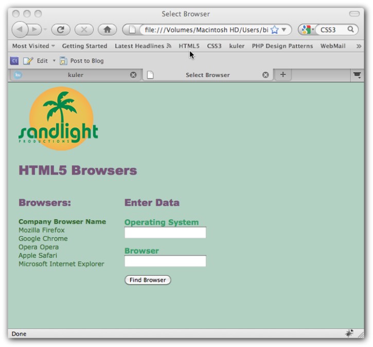
Figure 1: The Mozilla Firefox browser.
Notice that in the URL window (the window where you put the HTML address) the reference is to file:///Volumes/Macintosh HD/ instead of an http:// address.
That’s because the page is sitting on the computer’s desktop. Also,
you’ll find that things looks differently if displayed in a Windows
environment than they do in a Macintosh one — even for the same browser.
(The example page is just for illustration and does not select browsers
for you.)
Google Chrome
Google, famous for its
search engine and maps, created its browser, Chrome, from the ground up
with HTML5 in mind. It has browsers for Apple, Windows, and Linux
operating systems — all available for free. Figure 2 shows the same
exact Web page on the same computer as Figure 11 — see if you can
detect the differences.
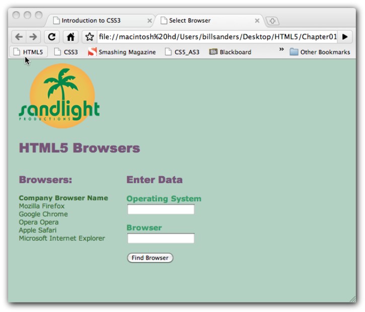
Figure 2: Google Chrome displaying the same HTML5 page as shown in Figure 1.
Other than the different
styles of the two browsers, it can be difficult to see the differences
in the page. With a simple page, subtle differences won’t affect how
your Web page looks. However, as your pages get bigger and more complex,
small differences can grow.
One Web page development tool, Adobe Browserlab (https://browserlab.adobe.com)
lets you see how a Web page looks in different browsers at the same
time. Browserlab can be run directly from Adobe Dreamweaver CS5, or you
can visit the Adobe Browserlab Web page. To get a little more dramatic
difference, let’s compare the sample Web page in Firefox on a Macintosh
with one in Windows 7 running Google Chrome. Figure 1-6 shows what the
side-by-side comparison looks like. (Graphics are not displayed.)
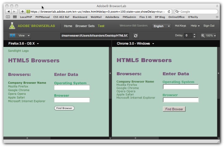
Figure 3: Comparing browsers in Adobe Browserlab.
Part of the difference is due
to the ways in which Windows and the Macintosh operating systems display
text and user interfaces (UIs). Another view that Browserlab provides
is called an onionskin; it superimposes one over the other and you can
see more precisely where text and UIs appear. Figure 4 shows this
difference.
The blurrier an
onionskin appears, the greater the differences in the way the Web page
materials are rendered. In Figure 3, you can see that the view is very
blurry, indicating that some key differences exist between the browsers
and operating systems.
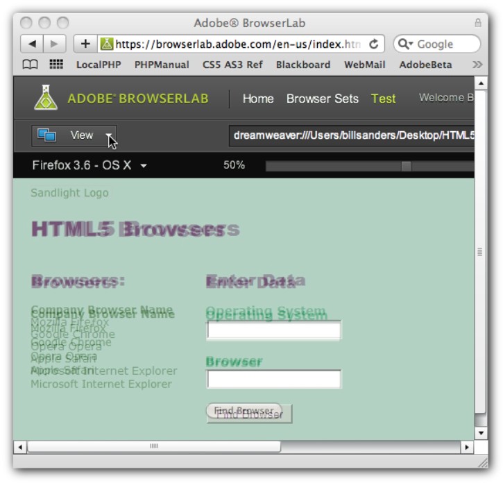
Figure 4: An onionskin view of superimposed browsers.
Opera
When I was examining the Opera
browser at the time of initially testing the different browsers, it
seemed to have the best HTML5 features actually working. Plus, Opera has
a special browser, Opera Mini 5, that you can download free for your
mobile devices. HTML5 works fine on mobile devices, as you can see in
Figure 5, which displays the sample Web page on an iPhone using
Opera’s mobile browser.
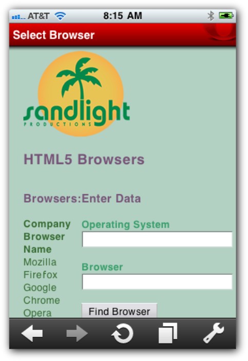
Figure 5: Opera Mini 5 browser.
Full-size Opera browsers
are available for Windows, Macintosh, and Linux operating systems as
well. When creating Web pages, you should plan for different size
devices. As you can see, the sample application we’ve been using can
fully fit in a mobile device as well as on large screens.
Apple Safari
Apple makes Safari
browsers for Macintosh and Windows as well as for mobile devices. For
comparative purposes, Figure 7 shows how the sample application looks
on Apple’s Mobile Safari, developed for the iPhone. Compare this with
Opera Mini 5 in Figure 6.
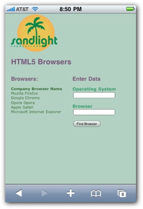
Figure 7: The Mobile Safari browser.
Just as there are few
differences between the appearances of the Web pages as viewed on a
desktop or laptop computer, you shouldn’t see many differences between
what different browsers show on mobile devices. That’s a good thing! Web
developers waste a good deal of time trying to make sure that all their
pages look the same on different browsers and platforms. With a common
implementation of HTML5, that shouldn’t be a problem. Other unique
features on browsers, such as having tabs, or other characteristics that
make Web browsing easier, are fine as long as the browser’s
implementation of HTML5 is implemented according to the specifications
defined by the World Wide Web Consortium (W3C).
Microsoft Internet Explorer 9
At the time of this
writing, Internet Explorer 9 (IE9) was still in beta stage. According to
Microsoft, its IE9 browser will be fully compliant with HTML5
standards. Where possible,I’ve included examples
showing the IE9 at work with HTML5 Web pages using the IE9 beta browser.
Figure 8 shows the test page in the IE9 beta browser.
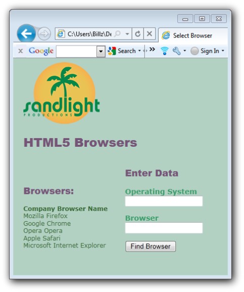
Figure 8: Internet Explorer 9.
Previewing different displays
As you’ve seen, Web pages
can be viewed on a number of different browsers and operating systems.
Web developers need to consider the characteristics of the devices that
their pages are to be viewed on, such as a desktop computer or a mobile
phone. Suppose you develop for an iPhone and iPad (or some other mobile
device and tablet); if you can preview your work side by side, you’re
better able to make comparisons. Adobe Dreamweaver, a Web page
development tool, allows the developer to view multiple dimensions
simultaneously, as shown in Figure 9.
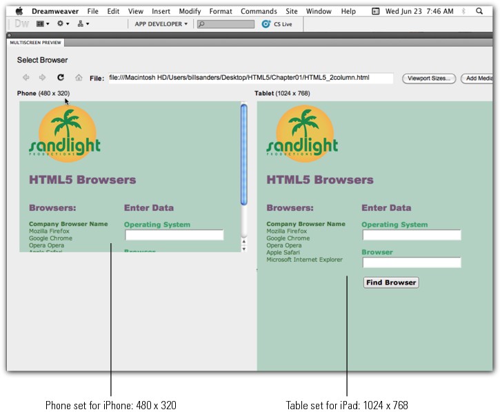
Figure 10: Multiscreen preview in Adobe Dreamweaver.
You
can change the device dimensions. For example, a Motorola Droid
displays an 854 x 480 screen and a Sony VAIO UX displays a 1024 x 600
screen. The multiscreen preview helps you decide how to set up your page
to optimize it for your viewers. Finding the best compromise is an art
and one that can be made less onerous by knowing as much as possible
about your audience and the devices they’re likely to use to view your
materials.