Just as our markup is much the same as we would be writing for a regular website, our
CSS will be relatively similar to what we’re used to. Unfortunately, CSS support on mobile
devices is less than terrific, and while the information is a couple of years old now.
Here are the basic principles for creating the stylesheets for our app: Let’s set up our base CSS file and start layering some style on our app. First up, we’ll
need to update our HTML to include the reference to our CSS file: listing 1. spots.html
(excerpt)<!doctype html>
<!--[if IEMobile 7 ]><html class="no-js iem7"><![endif]-->
<!--[if (gt IEMobile 7)|!(IEMobile)]><!--> <html class="no-js"><!--<![endif]-->
<head>
<title>StarTrackr</title>
<link rel="stylesheet" href="stylesheets/screen.css" media="screen">
</head>
|
Nothing unusual there. Mobile browsers are no different from their desktop equivalents
in that they all apply default CSS styles differently, so to get our CSS started, we’ll
begin with a very basic reset to clear out some of those various defaults: listing 2. stylesheets/screen.css (excerpt)html, body, div, span, object, iframe, h1, h2, h3, h4, h5, h6, p,
blockquote, pre, abbr, address, cite, code, del, dfn, em, img, ins,
kbd, q, samp, small, strong, sub, sup, var, b, i, dl, dt, dd, ol,
ul, li, fieldset, form, label, legend, table, caption, tbody, tfoot,
thead, tr, th, td, article, aside, canvas, details, figcaption,
figure, footer, header, hgroup, menu, nav, section, summary, time,
mark, audio, video {
margin: 0;
padding: 0;
border: 0;
outline: 0;
font-size: 100%;
vertical-align: baseline;
background: transparent;
}
body {
font-family: "HelveticaNeue", Arial, Helvetica, sans-serif;
}
|
Now that we have the shell of an HTML page and a stylesheet to work with, let’s take a
look at the construction of the various components of the StarTrackr application. 1. The Tab BarThe HTML for the tab bar is quite simple. We’re going to use the tried and true
practice of marking up our navigation as an unordered list. This is old territory for most
of us, but it’s worth reminding ourselves why the <ul> element makes sense for navigation: it’s
the closest semantic representation of what our navigation really is, a list of
pages: listing 3. spots.html (excerpt)<ul id="tab-bar" class="page-spots">
<li id="tab-spots">
<a href="#">Spots</a>
</li>
<li id="tab-sighting">
<a href="#">Add a sighting</a>
</li>
<li id="tab-stars">
<a href="#">Stars</a>
</li>
</ul><!-- #tab-bar -->
|
Points to note: We’re giving the main tab bar element (<ul>) an <id> of <tab-bar>. Each of the list items (<li>) in the tab bar has
an <id> as well, (we’ll use this a little later on
once we start to apply our styles). The main tab bar element has a <class> of
<page-spots>, giving us a hook for adding a
selected state to the navigation using CSS. We’re keeping the HTML as clean and simple as possible. This structure gives us
everything we’ll need to implement our sexy tab bar design in CSS. There are comments to indicate the end of blocks; while they’re unnecessary,
they’re nice for development purposes.
CSS for mobile devices presents a relatively new concern for most digital designers:
pixel density, or rather, resolution. Where desktop computers have been fairly
stagnant in terms of screen resolution, the spectrum of mobile devices sees a whole range
of resolutions. The solution is to use relative values for layout, and that means
percentages and our old friend, the em.
Note: A quick primer: an
em is a unit of measurement in typography. In CSS, it’s used as a
measurement of the vertical space needed for any given letter in a font; hence, if the
font size is 16 pixels, the value of 1 em will equal 16 pixels. The advantages to using
relative units like ems and percentages is twofold. The use of percentages for layout
means that our application is more likely to look correct across the broad spectrum of
mobile devices. While we’re expecting our target platforms to be generally similar in
terms of their screen size, there’s no way to we can used a pixel-based layout to target
every platform. Secondly, with our interface and layout specified entirely in ems and
percentages, we can adjust the overall scale of our interface by adjusting the
font-size on our base element, which in our case will
be the <body>. This becomes important as we look to
adjust our interface on devices with different screen densities and physical
sizes.
The CSS for the tab bar is a little more involved. To start with, we’re going
to build up the structure of the tab bar without the fancy visual fluff that we have in
our design (don’t worry, we’ll reach the fancy parts a bit later on): listing 4. stylesheets/screen.css (excerpt)#tab-bar {
background: #050405;
border-bottom: 1px #441d22 solid;
position: relative;
zoom: 1;
}
/* Clearfix to stop our floats escaping */
#tab-bar:before, #tab-bar:after {
content: "\0020";
display: block;
height: 0;
overflow: hidden;
}
#tab-bar:after {
clear: both;
}
/* Float our three list items so they’re evenly spaced */
#tab-bar li {
display: inline;
float: left;
width: 33.333%;
}
/* Set a elements as blocks */
#tab-bar a {
color: #cdcdcd;
display: block;
font-size: 0.875em; /* 12px / 14px */
font-weight: bold;
height: 4.583em; /* 55px / 12px */
margin: 0 0.833em; /* 10px / 12px */
overflow: hidden;
padding-top: 0.428em; /* 6px / 14px */
position: relative;
text-align: center;
text-decoration: none;
}
|
We can add a temporary background color to the <a> elements for a
look at how it’s shaping up so far across a couple of different browsers and device
resolutions—the results are shown in Figure 1. 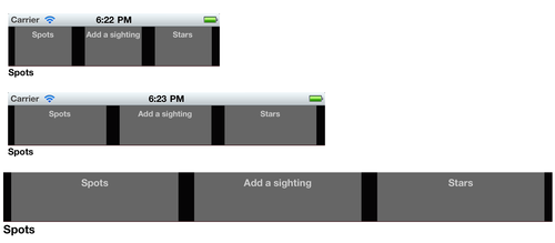
Some nice solid spacing so far. By using percentages, we have an evenly balanced tab
bar across all these different browser widths; establishing this solid base means we can
start to build more complex structures on top without worrying about breaking anything too
badly. So let’s go ahead and do this! Our design specifies that the “Add a sighting” tab
needs to differ from the other two tabs—it extends beyond the tab bar and is reversed out.
As we’ve given each of the tabs a unique ID, we can override the inherited styles
thusly: listing 5. stylesheets/screen.css (excerpt)#tab-sighting a {
background: #d5d2d2;
color: #111111;
height: 4.95em;
margin: 0 0 -0.367em;
}
|
By setting a height that’s larger than the other tabs, the “Add a sighting” element
will be taller. The problem is that the containing <ul>
will grow to match this height, so instead of “Add a sighting” overlapping, the other tabs
simply fall short. The trick to extending it is the negative bottom margin. By setting this to the difference between the height
of the “Add a sighting” tab and the height of the standard tabs, we achieve the lovely
little overlap we were after, as Figure 2 shows. 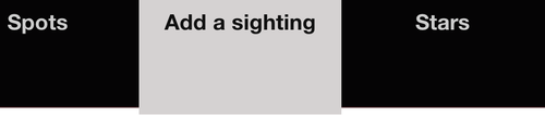
We noted before that we added an additional class to the tab bar as a hook for showing
the state of the navigation. The technique is often used by applying an <id> or <class> to the <body> element, and then using
that selector in CSS to make page-specific changes. We’ll essentially be doing this,
except we’ll be limiting the scope so we have a bit more control. This will be useful down
the track when we look at fancier methods of transitioning between pages. If we’re on the
“Spots” page, we want to make the “Spots” tab look selected, so our parent <class> will be <page-spots>. We can use the following code to change the color of the text on
the selected
tab: listing 6. stylesheets/screen.css (excerpt).page-spots #tab-spots a {
color: #ebc466;
}
|
We’re going to leave the tab bar there for now, but later on you’ll see that we’ll
hook into this selector again to dress up our tab bar a little more. If you’d like to have
a look at the full CSS used to create the final tab bar for StarTrackr, jump into the code
archive and have a poke around the screen.css file.
|