Viewing Mining Models
SSAS provides
algorithm-specific mining model viewers within Visual Studio Analysis
Services projects (and in SQL Server Management Studio—more on that
later) that greatly ease the otherwise daunting task of interpreting a
model’s contents, observed patterns, and correlations. The visualization
tools provided by the viewers thus make data mining accessible to a
larger audience than do traditional data mining products.
Take, for example,
clustering, which is used to create subsets (clusters) of your data that
share common characteristics. Imagine trying to digest the implications
of a clustering model with 10 customer clusters defined on 8, 10, or 12
characteristics. How would you figure out the identifying
characteristics of each cluster? How could you determine whether the
resulting clusters are similar or dissimilar? The Microsoft Cluster
Viewer makes it extremely easy to answer such questions. We’ll see how
next.
Using the Cluster Viewer
After you have
deployed and processed all of the mining models in the
CustomerProfitCategory mining structure, you will be brought to the
Mining Model Viewer tab. If it’s not already selected, choose
CustomerProfitCategory_CL from the Mining Model drop-down list. Then
choose Microsoft Cluster Viewer from the Viewer drop-down list. The
Cluster Viewer offers four ways to view the results of a clustering
model: Cluster Diagram, Cluster Profiles, Cluster Characteristics, and
Cluster Discrimination. A separate tab is provided for each of these
visualization tools.
Cluster Diagram
The Cluster Diagram tab
of the Cluster Viewer contains a diagram in which each “bubble”
represents a cluster from the model. The cluster diagram uses color to
indicate data density: the darker the bubble, the more records that
cluster contains. You control the actual variable and value indicated by
the shading by using the Shading Variable
and State drop-down lists; you can select any input or predictable
column. For example, if you select ProfitCategory from the Shading
Variable drop-down list and select High from the State drop-down list,
the diagram will configure itself so that darker clusters contain a
greater number of high-profit customers relative to lighter ones. This
is shown in Figure 11.
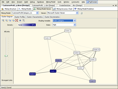
The darkest bubbles are 3,
5, and 9—these are the clusters with a relatively large concentration of
high-profit customers. Hovering the mouse pointer over a cluster
displays the exact percentage of customers in that cluster who are in
the high-profit category. Now select IncomeGroup from the Shading
Variable drop-down list and select High from the State drop-down list.
The clusters 9, 6, and 3 should now be the darkest bubbles. Select
IsCarOwner from the Shading Variable drop-down list and N from the State
drop-down list. The darkest clusters should now be 8, 7, and 5.
By examining
the cluster characteristics in this manner, we can assign more
meaningful names to the clusters. You can rename a cluster by
right-clicking the cluster in the diagram and choosing Rename. For
example, you can right-click cluster 3 and rename it “High Profit, High
Income, Car Owner” and then right-click cluster 5 and rename it “High
Profit, Lower Income, Less Likely Car Owner.”
The clusters are arranged
in the diagram according to their similarity. The shorter and darker
the line connecting the bubbles, the more similar the clusters. By
default, all links are shown in the diagram. By using the slider to the
left of the diagram, you can remove weaker links and identify which
clusters are the most similar.
Cluster Profiles
The Cluster Profiles tab, shown in Figure 12,
displays the distribution of input and predictable variables for each
customer cluster and for the entire population of customers. This tab is
particularly useful for getting an overall picture of the clusters
created by the mining model. Using the cluster profiles, you can easily
compare attributes across clusters and analyze cluster attributes
relative to the model’s full data population.
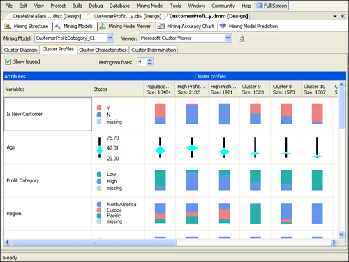
The
distribution of discrete attributes is shown using a colored bar. By
default, the Cluster Profile tab shows the four most common categories
in the population with all others grouped into a fifth category. You can
change the number of categories by increasing or decreasing the number
in the Histogram Bars text box. Go to the row showing the IncomeGroup
attribute and then scroll to the right to see how the distribution of
IncomeGroup varies across the clusters. Compare the histogram bar
between the population “High Profit, High Income, Car Owner” and “High
Profit, Lower Income, Less Likely Car Owner” clusters. (You might need
to click the Refresh Viewer Content button at the top of the Mining
Model Viewer tab in order to see the new names of your clusters.) The
histogram bar for the population is divided into three relatively equal
segments because the population has relatively equal numbers of
customers in the high, moderate, and low income groups. In contrast, the
High Income segment of the histogram bar for the “High Profit, High
Income, Car Owner” cluster is larger than the other income segments for
that cluster because it has relatively more customers that are in the
High Income group. The High Income segment of the histogram bar for the
“High Profit, Lower Income, Less Likely Car Owner” cluster is virtually
indiscernible. If you hover your mouse pointer over the histogram bar,
however, you can see that the High Income segment comprises 0.5 percent
of the bar.
The
distribution of continuous characteristics is shown using a bar and
diamond chart. Go to the row showing the age attribute. The black bar
represents the range of ages in the cluster, with the median age at the
midpoint of the bar. The midpoint of the diamond represents the average
age of the customers in the cluster. The standard deviation (a
statistical measure of how spread-out the data is) of age for the
cluster is indicated by the size of the diamond. Compare the diamond
chart between the population and the “High Profit, High Income, Car
Owner” and “High Profit, Lower Income, Less Likely Car Owner” clusters.
The higher and flatter diamond for the “High Profit, High Income, Car
Owner” cluster indicates that customers in that cluster are relatively
older than in the total population and that the age variation in the
cluster is less than in the total population. You can hover the mouse
pointer over the diamond chart to see the precise average age and
standard deviation represented by the chart.
By default, the cluster
characteristics are shown alphabetically from top to bottom. Locate the
cluster you renamed “High Profit, High Income, Car Owner” and click its
column heading. The cluster attributes will be reordered according to
the characteristics that most differentiate it from the total
population. Click the cluster you renamed “High Profit, Lower Income,
Less Likely Car Owner” to see how the order of the characteristics
changes.
Initially, clusters
are ordered by size from left to right. You can change the order of the
clusters by dragging and dropping clusters to the desired location. Figure 20-20
shows the cluster attributes ordered by importance for the “High
Profit, High Income, Car Owner” cluster and the clusters ordered by
percentage of customers in the high-profit category.
Cluster Characteristics
The Cluster
Characteristics tab lets you examine the attributes of a particular
cluster. By default, attributes for the model’s entire data population
are shown. To see the attributes of a particular cluster instead, you
can select one from the Cluster drop-down list. For example, if you
select the “High Profit, High Income, Car Owner” cluster, the attributes
will be reordered according to probability that they appear in that
cluster, as shown in Figure 13.
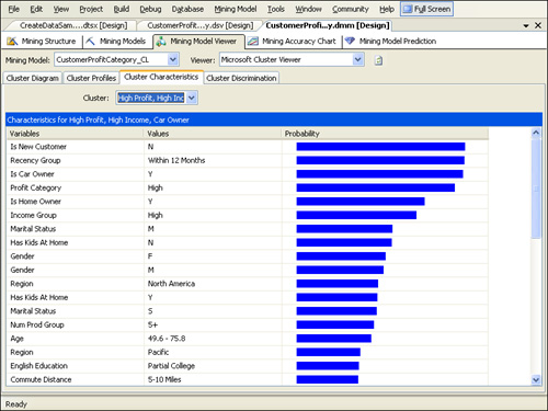
The attribute with the highest probability in this cluster is that of not being a new customer— in other words, there is a 95 percent chance that a customer in this cluster is not a new customer.
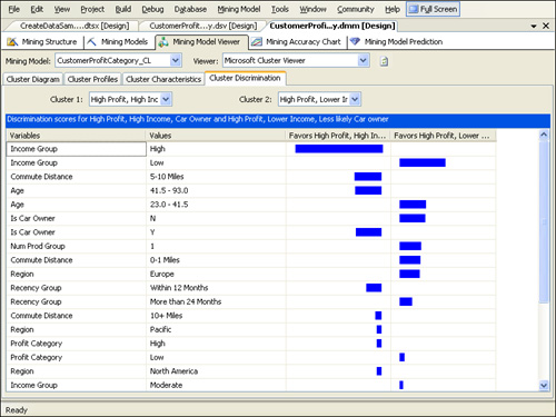
Cluster Discrimination
The Cluster
Discrimination tab is most useful for comparing two clusters and
understanding what most distinguishes them. Select “High Profit, High
Income, Car Owner” from the Cluster 1 drop-down list and “High Profit,
Lower Income, Less Likely Car Owner” from the Cluster 2 drop-down list.
The attributes that are most important in differentiating the two
clusters are shown by order of importance. A bar indicates the cluster
in which you are more likely to find the particular attribute, and the
size of the bar indicates the importance of the attribute. As you can
see from Figure 14, the two most important distinguishing attributes of the selected clusters are the high-income and low-income groups.
We’ve
covered the Cluster Viewer and its constituent tabs in depth, but don’t
forget that we have mining models in our mining structure that use the
Decision Trees and Naïve Bayes algorithms rather than the Clustering
algorithm. We need to also understand how to use the Microsoft Tree
Viewer and the Naïve Bayes Viewer—the respective viewers for these
models.
Using the Tree Viewer
To view the results of
the Decision Trees model, select CustomerProfitCategory_DT from the
Mining Model drop-down list. This will bring up the Microsoft Tree
Viewer. The Tree Viewer offers two views of the results from the model
estimation: a decision tree and a dependency network view. A separate
tree is created for each predictable variable in the decision tree view.
You can select the tree to view using the Tree drop-down list. In our
model, we have two trees, one for predicting customer profitability and
one for predicting the number of products purchased.
Decision Tree
Select ProfitCategory
from the Tree drop-down list to reveal the tree for that variable. The
Tree Viewer provides a sideways view of a decision tree with the root
node at the far left. Decision trees branch, or split, at each node
according to the attribute that is most important for determining the
predictable column at that node. By inference, this means that the first
split shown from the root All node is the most important characteristic
for determining the profitability of a customer. As shown in Figure 15, the first split in the ProfitCategory tree is premised on whether the customer is a new customer.
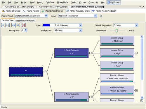
The Tree Viewer shows a
bar chart of the ProfitCategory at each node of the tree and uses the
background shading of a node to indicate the concentration of cases in
that node. By default, the shading of the tree nodes indicates the
percentage of the population at that node. The shading is controlled by
the selection in the Background drop-down list, where you can select a
specific value for the ProfitCategory variable instead of the entire
population. If the predictable variable is continuous rather than
discrete, there will be a diamond chart in each node of the tree
indicating the mean, median, standard deviation, and range of the
predictable variable.
By default, up to
three levels of the tree are shown. You can change the default by using
the Default Expansion drop-down list. A change here changes the default
for all
decision trees viewed in the structure. To view more levels for the tree
without changing the default, use the Level slider or expand individual
branches of a tree by clicking the plus sign at the branch’s node. A
node with no plus sign is a leaf node, which means it has no child
branches and therefore cannot be expanded. Branches end when there are
no remaining input attributes that help determine the value of the
predictable variable at that node. The length of various branches in the
tree varies because they are data dependent.
Dependency Network
The Dependency Network tab for the CustomerProfitCategory_DT model is shown in Figure 16.
Each bubble in the dependency network represents a predictable variable
or an attribute that determined a split in the decision tree for a
predictable variable. Arrows connecting the attributes indicate the
direction of the relationship between the variables. An arrow to an attribute indicates that it is predicted, and an arrow from
an attribute indicates that it is a predictor. The double-headed arrow
connecting ProfitCategory and NumProdGroup indicates that they predict
each other—each splits a node in the decision tree of the other. If we
had set the usage type of each of these variables to PredictOnly or
Input rather than Predict, we would not have been able to make this
observation.
Click
ProfitCategory. This activates color coding, as described in the legend
below the dependency network, to indicate whether an attribute predicts,
or is predicted by, ProfitCategory.
The
slider to the left of the dependency network allows you to filter out
all but the strongest links between variables. If you move the slider to
the bottom, you will see that the strongest predictor of ProfitCategory
is whether the customer is new. Slowly move the slider up. The next
bubble to become reddish-orange is Recency Group; this means that the
recentness of the last purchase is the second most important predictor
of customer profitability after whether the customer is new.
Now move the slider back
to the bottom and click NumProdGroup. The color coding now shows the
predictors of that variable instead of ProfitCategory. Even though no
predictors are colored, you can move the slider up slowly and see that
the first bubble to become pink is ProfitCategory, revealing that the
most important determinant of the number of products purchased is the
profitability of the customer.
Using the Naïve Bayes Viewer
We have yet to view our
Naïve Bayes model. To do so, simply select CustomerProfitCategory_NB
from the Mining Model drop-down list, bringing up the Naïve Bayes
Viewer. The viewer has four tabs: Dependency Network, Attribute
Profiles, Attribute Characteristics, and Attribute Discrimination. Our
experience with the Cluster Viewer and Tree Viewer will serve us well
here because we have encountered slightly different versions of all four
of these tabs in those two viewers.
Dependency Network
The Dependency
Network tab of the Naïve Bayes Viewer looks and works the same way as
the Dependency Network tab of the Tree Viewer, but it reveals slightly
different conclusions. As before, a slider to the left of the tab
filters out all but the strongest determining characteristics of
customer profitability. If you move the slider all the way to the bottom
and then slowly move it up, you will see that according to the Naïve
Bayes model, the most important predictors of customer profitability are
whether the customer is a new customer, followed by the number of
products the customer purchased.
This differs from
the decision tree model’s determination of customer profit. That model
suggests that after being a new customer, the recency of the last
purchase was the most important predictor of customer profitability.
This underscores an important point: even though the viewers for the two
models use the same visualization technique, each one uses a different
algorithm and might indicate slightly different conclusions.
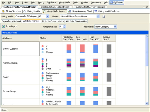
Attribute Profiles, Attribute Characteristics, and Attribute Discrimination
The
Attribute Profiles, Attribute Characteristics, and Attribute
Discrimination tabs of the Naïve Bayes Viewer are functionally
equivalent to the Cluster Profiles, Cluster Characteristics, and Cluster
Discrimination tabs of the Cluster Viewer. However, instead of allowing
a comparison of the distribution of input attributes across clusters,
they allow a comparison of the distribution of input attributes across
distinct values of the predicted column—in our case, the ProfitCategory
column.
Click the Attribute Profiles tab and then select the Low profit group. As shown in Figure 17,
according to our Naïve Bayes model, the most important characteristics
for predicting whether a customer is a low-profit customer are whether
the person is a new customer, the number of products purchased, and the
region.